
The Evolution of Restaurant Websites: A Call for Mobile-First, User-Friendly Design
In today’s fast-paced digital world, finding a place to eat often begins not with a walk down the street, but with a tap on a smartphone screen. Whether you’re planning a dinner date, searching for a quick lunch spot, or checking wait times for your favorite eatery, your mobile device is your primary tool. Yet, for far too long, restaurant websites have lagged behind, presenting a frustrating paradox for the hungry consumer. The expectation is a seamless experience, but the reality is often a digital obstacle course.
It was with this pervasive frustration in mind that I almost overlooked a small but significant piece of news. A press release from GoDaddy landed in my inbox on a quiet Friday afternoon, detailing new functionality and specialized templates for restaurants within their website builder (GoDaddy Website Builder). My initial reaction, being somewhat jaded by generic small business website solutions, was to hit the delete button. But then, a phrase caught my eye: “specialized websites for restaurants” and “mobile.” Could this finally address the glaring deficiencies that plague so many restaurant online presences?
My digital pet peeves concerning restaurant websites are numerous, and I’m confident I’m not alone in experiencing them. For an industry so reliant on immediate customer decisions and on-the-go interactions, the collective state of their digital storefronts is, in many cases, appalling. These websites are, almost universally, the one category I access predominantly from a mobile device. I’m out, I’m hungry, and I need information quickly and efficiently. What I often get instead is a lesson in digital exasperation.
The Common Culinary Catastrophes of Mobile Websites
Let’s dive into the core issues that make most restaurant websites a pain to navigate on a smartphone:
1. The Elusive Click-to-Call Feature
One of the most maddening experiences is attempting to call a restaurant. You find the website, locate the phone number, and confidently tap on it, expecting your phone’s dialer to spring to life. Instead, nothing happens. You tap again, perhaps with more vigor, only to realize that the number isn’t text at all – it’s an image. A static, unclickable graphic. This means you have to painstakingly remember or write down the number, switch to your phone’s dialer app, and manually type it in. In an age of instant gratification, this archaic design choice is not just inconvenient; it’s a barrier to immediate customer engagement and often results in lost business.
2. The Dreaded PDF Menu
Another prevalent digital sin is the menu presented as a PDF. I would venture to guess that nine out of ten restaurant websites rely on a PDF for their online menu. While PDFs serve a purpose for print, they are an absolute disaster for mobile viewing. You’re forced to pinch, zoom, scroll endlessly, and wait for the document to load, often encountering blurry text or tiny images. The experience is clunky, slow, and far from user-friendly. Furthermore, search engines struggle to crawl and index content within PDFs effectively, meaning your delicious menu items might not be discoverable in organic searches.
3. Beyond the Big Two: Other Mobile Mayhem
- Lack of Responsive Design: Many sites are simply scaled-down desktop versions, making text microscopic and buttons impossible to tap accurately.
- Slow Loading Times: Overly large image files, unoptimized code, and legacy technologies can make a site take ages to load on a mobile connection, leading to high bounce rates.
- Outdated Information: Menus, hours, and special events are frequently not kept current, frustrating customers who arrive to find different offerings or closed doors.
- Poor Navigation: Cluttered interfaces, hidden menus, and unintuitive layouts make it difficult to find critical information like directions, hours, or reservation options.
- Flash-Based Content: While less common now, some older sites still use Flash, which is completely incompatible with most modern mobile devices.
- Intrusive Pop-ups: Excessive or poorly timed pop-ups for newsletters or specials can obscure content and annoy users, especially on smaller screens.
The Indisputable Case for Mobile-First Design in Restaurants
These issues aren’t just minor inconveniences; they represent significant missed opportunities and potential revenue loss. The modern consumer expects speed, convenience, and clarity. For restaurants, a strong mobile presence is no longer a luxury but a fundamental requirement for success. Consider the impact:
- Local SEO Dominance: Google heavily prioritizes mobile-friendly websites, especially for local searches like “restaurants near me.” A mobile-optimized site ranks higher, appearing more prominently in search results and Google Maps.
- User Experience (UX) and Customer Retention: A smooth mobile experience translates to happier customers, increased engagement, and a higher likelihood of conversion (visiting, ordering, reserving). A frustrating experience, conversely, drives potential customers away, likely to a competitor with a better online presence.
- Brand Perception: A modern, functional website reflects positively on the restaurant’s brand, conveying professionalism and attention to detail. An outdated, broken site suggests the opposite.
- Competitive Advantage: In a crowded market, having a superior digital storefront can be a key differentiator, attracting customers who value convenience and accessibility.
- Post-Pandemic Necessity: The reliance on online ordering, reservations, and information access has only accelerated since recent global events. A robust digital presence is essential for resilience and growth.
A Glimmer of Hope: GoDaddy’s Specialized Restaurant Builder in Action
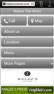
Intrigued by the press release, I decided to put GoDaddy’s claims to the test. The example provided was Malee’s Thai Bistro in Scottsdale. I pulled up their website (maleesonmain.com) on my Android device, and what I saw was a refreshing change. The screenshot accompanying this article is a testament to its effectiveness.
It was, dare I say, nearly perfect. The design was clean, the information was clear, and critically, it addressed every single one of my pet peeves:
- One-Tap Calling: Prominently displayed was a clear “Call” button. A single tap instantly opened my phone’s dialer with Malee’s number pre-populated. This is achieved through simple HTML, typically using a
tag, a standard web practice that far too many sites overlook. - Instant Directions: Right next to the call button was a “Map” button. Tapping this immediately launched my phone’s mapping application, providing precise directions to the bistro. This seamless integration leverages another common HTML attribute, linking directly to mapping services, eliminating manual input and potential errors.
- Interactive, Web-Native Menu: The “Menu” button was perhaps the most satisfying. Instead of a cumbersome PDF, it opened an interactive, scrollable, and beautifully presented menu directly within the website. This native web menu allows for easy browsing, scaling, and importantly, makes the menu content discoverable by search engines. The press release noted that these menus are actually managed by a third-party service, which suggests a smart integration that allows restaurants to update their offerings easily without needing a web developer. This not only enhances user experience but also improves SEO, as individual menu items can be indexed.
- Overall Mobile Optimization: The entire site was clearly mobile-optimized. A quick scroll revealed operating hours, address, and other vital information, all formatted for easy readability on a small screen. The layout was responsive, adapting flawlessly to the device’s screen size, ensuring no content was cut off or difficult to access.
The only thing I noted as potentially missing was a direct link to a reservation system like OpenTable, though I don’t know if Malee’s Thai Bistro uses such a service. However, integrating a reservation widget from platforms like OpenTable, Resy, or Tock is a standard feature in most modern website builders and would be a logical next step for any restaurant. From a mobile user’s perspective, this site was a revelation, demonstrating how restaurant websites should function.
Building the Ideal Restaurant Website: Key Elements
Regardless of the specific builder used, restaurants looking to thrive in the digital age should prioritize these elements for their online presence:
- Truly Responsive Design: The website must adapt seamlessly to any screen size, from desktop monitors to the smallest smartphones.
- Essential Information Upfront: Clearly display address, phone number, operating hours, and a direct link to the menu on the homepage or easily accessible sections.
- Clickable Contact Information: Implement
tel:links for phone numbers and links to mapping applications for addresses. - Web-Native, Interactive Menus: Ditch PDFs. Embrace HTML menus that are easy to browse, searchable, and SEO-friendly. Include high-quality photos of dishes.
- High-Quality Visuals: Invest in professional photography for food and interior ambiance. Visually appealing content is crucial for enticing potential diners.
- Online Ordering Integration: If applicable, a direct, intuitive online ordering system (either native or integrated with a third-party like Toast, Square, Uber Eats, etc.) is essential.
- Reservation System: Integrate with popular platforms like OpenTable, Resy, or provide an internal reservation form.
- Fast Loading Speed: Optimize images and code to ensure quick load times, crucial for mobile users on varying data connections.
- Social Media Links: Provide links to active social media profiles, but ensure they open in new tabs to keep users on your site.
- About Us/Our Story: Share the restaurant’s history, philosophy, or chef’s background to build a connection with customers.
- Accessibility (WCAG Compliance): Design with all users in mind, including those with disabilities, following Web Content Accessibility Guidelines.
- Secure (HTTPS): Ensure your website is secure with an SSL certificate, indicated by “HTTPS” in the URL. This builds trust and is a ranking factor for search engines.
- Regular Updates: Keep all information – menus, hours, events, promotions – current and accurate.
The Future is Now: Empowering Restaurants Digitally
While I won’t delve into the desktop version of Malee’s Thai Bistro, from a mobile standpoint, it’s a stellar example of what a restaurant website should be. I’m certain other robust website builders, like Squarespace or Wix, offer similar specialized templates and functionalities for restaurants. In fact, a quick search for Malee’s brought up what I assume is an older website they created with another company, which was also quite decent. This underscores the point that the tools exist.
The core message is simple: restaurants must prioritize their digital presence. In an era where dining decisions are often made on the fly, with a smartphone in hand, an accessible, informative, and mobile-friendly website is no longer an optional extra – it’s an absolute necessity. It’s time for more restaurants to get on the bandwagon and embrace a digital storefront that truly serves their customers and their business. A great meal experience often begins long before a customer steps through your door, starting with a seamless and satisfying online interaction.