Free User Interface Advice for Domain Firms
Domain firms aren’t known for good user interfaces. Here are a few suggestions to help.
A user interface designer charges a couple hundred bucks an hour to help firms improve user experience at their web sites. I’m not a UI designer, but I do have some free advice for a few domain firms. Disclaimer: advice is worth what you pay for it.
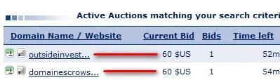
Sedo – Sedo runs perhaps the most successful online auctions. But I get frustrated looking through the list of auctions since domain names over 13 characters are truncated. Take a look at this:
Why does OutsideInvestors.com need to be truncated with all of that extra room (where the red line is)? You have to mouseover the domain to see what it is.
GoDaddy – When I show up on GoDaddy’s home page, I assume I can buy Danica Patrick. Following all, she has the most prominent real estate on the screen:
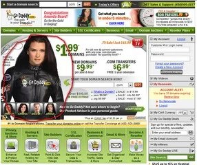
When I order a domain name, I keep assuming Danica will pop up as an upsell during checkout. I can add private registration, a web hosting plan, personalized e-mail, an SSL certificate, a poster of Bob Parsons, a pound of dirt, and a kitchen sink. But I can’t add Danica. What gives?
Parked.com – I think Parked has one of the best user interfaces in the parking industry, especially its slick AJAX dashboard for editing domains. But there’s one thing that has always bothered me: the overview graph on the home page:
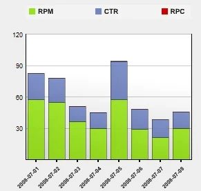
It doesn’t make sense to have a stacked column graph for RPM, CTR, and RPC. Heck, RPC is so modest compared to the rest that you can’t even see it. Not to mention that the sum of these three measures doesn’t mean much. A dual-axis line graph might make sense, but this graph means nothing to me.
If something frustrates you regarding another firm’s UI, let it rip.