
ICANN’s Digital Frontier: Beyond a Facelift Towards a Truly Usable Online Presence
In the vast, interconnected landscape of the internet, the Internet Corporation for Assigned Names and Numbers (ICANN) stands as a pivotal guardian, overseeing the global Domain Name System (DNS) and ensuring its stable and secure operation. For an organization with such profound global responsibility and a diverse stakeholder community spanning governments, businesses, technical experts, and civil society, its primary public-facing interface—its website—serves as an indispensable communication tool. Recently, ICANN.org received a minor aesthetic update, a subtle refresh that brings a welcome, albeit limited, change. While these visual tweaks are a step in the right direction, they merely scratch the surface of a deeper, more fundamental challenge: transforming ICANN’s online presence into a truly intuitive, accessible, and user-friendly resource for its global audience.
The Evolving Digital Landscape and ICANN’s Critical Role
ICANN’s mission is complex, technical, and often involves intricate policy discussions that impact billions of internet users worldwide. From coordinating the unique identifiers that make up the internet’s addressing system to fostering competition and participation in the domain name marketplace, ICANN’s work underpins much of our digital lives. Consequently, its website is not merely a corporate brochure; it is a vital hub for transparency, stakeholder engagement, policy development, and information dissemination. It serves as a repository for historical documents, a platform for ongoing consultations, and a primary channel for announcing critical operational changes. Therefore, the usability, clarity, and navigability of ICANN.org directly reflect the organization’s commitment to openness, participation, and effective governance.
In an age where digital fluency is paramount and user experience (UX) design dictates public engagement, expectations for a modern website are incredibly high. Users anticipate clean interfaces, logical navigation, and content that is easy to find and understand, regardless of their technical background or geographic location. For an organization like ICANN, whose decisions affect a global, multilingual audience, these expectations are amplified. A cumbersome website can become a significant barrier, hindering participation, obscuring vital information, and ultimately undermining the very transparency ICANN strives to uphold.
A Glimmer of Change: The Recent Visual Refresh
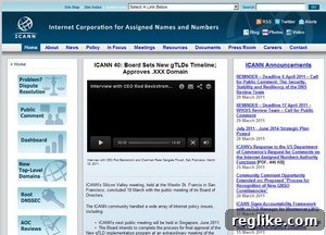
The recent update to ICANN.org primarily focuses on its visual aesthetics, offering a fresh coat of paint to an interface that, for many years, evoked a sense of a bygone digital era. The most noticeable change is a shift from a somewhat heavy, dark blue color scheme to a lighter, more contemporary white backdrop. This move away from the older design paradigm immediately creates a perception of modernity and provides a cleaner canvas for content presentation. The aesthetic impact is undeniable; the site feels more open, less cluttered, and generally more inviting to the eye.
Here’s how the site appeared before this subtle transformation:
And here is the new, refreshed look:
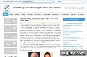
In addition to the color palette update, the social networking icons have also received a more contemporary design. This seemingly minor detail is important for an organization that relies heavily on digital communication and outreach. Modern icons convey an active, engaged presence on current digital platforms, helping ICANN to connect with a younger, more digitally native audience and maintain relevance in fast-evolving online communities. These visual refinements, while superficial in terms of functionality, contribute to a more professional and accessible brand image, signaling an intent to evolve with contemporary web standards.
Beyond the Paint: The Unyielding Challenge of Information Architecture
While the visual enhancements are a welcome change, they regrettably do not address the deeper, more pervasive issues that have long plagued ICANN.org: its byzantine content structure and overwhelming navigation. For an organization that generates vast amounts of information and engages in complex, ongoing discussions, a clear, logical, and user-centric information architecture is not a luxury, but a necessity. Unfortunately, the current navigation system remains largely unchanged, presenting a significant hurdle for anyone attempting to locate specific information.
The Labyrinthine Navigation: A Challenge to Information Discovery
The most striking example of this challenge is the sheer volume of options presented in the drop-down navigation menus. A manual count reveals a staggering 136 selections. To put this into perspective, best practices in web design strongly advocate for streamlined navigation paths, typically limiting top-level menu items to seven or nine categories, and sub-menus to a manageable number of relevant links. Presenting users with over a hundred options creates immense cognitive load, leading to choice paralysis, frustration, and ultimately, a high bounce rate as users abandon their search in despair.
The problem is not just the quantity of links but also their organization and relevance within a hierarchical structure. For instance, questions arise about why certain historical documents or highly specific resources are given such prominent placement in the main navigation. Does “Vint Cerf’s Legacy Letter to ICANN Community” – an important historical document, no doubt – truly need to be linked directly from the home page’s primary navigation, competing for attention with core functions like policy development, community forums, or operational updates? While every piece of content on ICANN.org holds value, its placement should reflect its overall relevance and frequency of access for the general user, not just its historical significance. Such deeply embedded, niche links dilute the effectiveness of the main navigation, making it incredibly difficult for users to distinguish between critical, frequently updated information and archival material.
Effective information architecture is about anticipating user needs and creating intuitive pathways to content. It involves categorizing, labeling, and sequencing information in a way that minimizes effort and maximizes discoverability. For ICANN, this means ensuring that stakeholders can easily find policy documents, meeting schedules, public comment opportunities, and technical resources without having to sift through an exhaustive and often confusing array of options.
The Unfinished Journey: The Abandoned Overhaul and its Implications
Adding to the frustration is the knowledge that efforts were previously underway to address these fundamental structural issues. Former ICANN staffer Kieren McCarthy was reportedly working on a comprehensive overhaul of the site, specifically aimed at improving information discoverability and user experience. Such an initiative would have involved a deep dive into content audits, user research, and a complete re-thinking of the site’s architecture – a costly and time-consuming endeavor crucial for an organization of ICANN’s stature.
It appears, however, that this significant and much-needed effort was unfortunately abandoned following McCarthy’s departure. This halting of a strategic project carries substantial implications. Firstly, it represents a considerable waste of resources – time, money, and expertise – that were invested in the initial phases of the overhaul. Secondly, it signals a potential lack of sustained commitment to improving the user experience, or perhaps a struggle with internal priorities. Abandoned projects, especially those aimed at fundamental improvements, can erode trust and reinforce the perception that systemic issues are being left unaddressed, perpetuating a cycle of user frustration and missed opportunities for engagement. The digital landscape continues to evolve rapidly, and stagnation in website development for a global body like ICANN can lead to increased irrelevance and decreased accessibility for its diverse stakeholders.
The Broader Impact: Why a Usable ICANN Website Matters
The challenges with ICANN.org’s usability extend far beyond mere inconvenience; they have tangible impacts on the organization’s core functions and its relationship with the global internet community. A difficult-to-navigate website can:
- Hinder Transparency and Accountability: If critical policy documents, meeting minutes, or public comment opportunities are buried deep within a convoluted structure, ICANN’s commitment to transparency becomes harder to demonstrate. Stakeholders may struggle to access the information needed to hold the organization accountable.
- Limit Global Participation: ICANN thrives on multi-stakeholder participation. A complex website disproportionately affects users with limited digital literacy, those accessing the internet through slower connections, or non-native English speakers. This creates barriers to entry, making it harder for diverse voices from around the world to engage meaningfully in internet governance processes.
- Reduce Efficiency and Trust: For researchers, policymakers, and industry professionals, time is valuable. A website that requires extensive effort to find basic information wastes their time and can foster a perception of inefficiency or disorganization within ICANN itself. Over time, this can erode trust and confidence in the organization’s operational effectiveness.
- Impact Educational Outreach: ICANN often needs to explain complex technical and policy issues to a broader audience. A cluttered website makes it difficult to present this information clearly and accessibly, impeding educational efforts and public understanding of its vital work.
Charting a Path Forward: Recommendations for a Truly Modern ICANN.org
To truly modernize its online presence, ICANN needs to move beyond cosmetic changes and embark on a comprehensive digital transformation that prioritizes user experience and robust information architecture. This journey would involve several key steps:
Prioritizing Information Architecture
The first and most crucial step is a complete overhaul of the site’s information architecture. This would involve:
- Content Audit: A thorough review of all existing content to determine its relevance, accuracy, and whether it still needs to be publicly accessible or if it can be archived.
- User Research and Journey Mapping: Understanding who the primary users are (e.g., policy experts, technical community, general public, media) and what tasks they are trying to accomplish on the site. This involves interviews, surveys, and usability testing.
- Card Sorting and Tree Testing: Involving actual users in determining how content should be grouped and labeled, and then testing the effectiveness of new navigation structures.
- Logical Hierarchy: Creating a clear, streamlined navigation hierarchy that prioritizes frequently accessed and critical information, while making less urgent content discoverable through logical pathways rather than top-level clutter.
Embracing User-Centric Design
A continuous commitment to user-centric design principles is essential. This means:
- Mobile Responsiveness: Ensuring the website functions flawlessly and aesthetically on all devices, from desktops to smartphones and tablets, given the global nature of internet access.
- Accessibility Standards: Adhering to WCAG (Web Content Accessibility Guidelines) to ensure the site is usable by people with disabilities, further expanding global inclusivity.
- Iterative Design and Feedback Loops: Implementing changes in phases, gathering user feedback continuously, and making ongoing adjustments rather than waiting for a large, infrequent overhaul.
Strategic Content Management
Beyond structure, the content itself needs attention:
- Plain Language: Simplifying complex technical and policy jargon where possible, or providing clear explanations for specialized terms, catering to a broader audience.
- Effective Search Functionality: Investing in a powerful and accurate internal search engine that can effectively navigate the vast content, providing a crucial alternative to menu navigation.
- Content Governance: Establishing clear guidelines for who creates, updates, and removes content, ensuring its ongoing relevance and quality.
Conclusion: A Vision for ICANN’s Digital Future
ICANN’s recent website facelift is a positive, albeit modest, step towards a more contemporary online presence. The shift to a cleaner visual aesthetic is appreciated and signals an awareness of modern design trends. However, the true measure of an effective website, especially for an organization as critical as ICANN, lies not just in its looks but in its fundamental usability and ability to serve its stakeholders effectively. The persistent issues with convoluted navigation and information architecture continue to pose significant challenges, hindering transparency, participation, and efficient access to vital information.
For ICANN to truly embody its role as a global leader in internet governance, its digital gateway must reflect its commitment to openness, inclusivity, and user empowerment. The opportunity exists for ICANN.org to evolve from a functional, if frustrating, archive into a dynamic, intuitive, and welcoming portal that genuinely facilitates global engagement and understanding of its crucial work. Embracing a comprehensive, user-centric approach to website redesign, focusing intensely on information architecture and continuous improvement, is not just about aesthetics; it is about reinforcing ICANN’s mission and ensuring its relevance and effectiveness in the digital age.