Moniker and SnapNames Get Fresh Web Sites
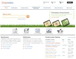
Sites get consistent look and UI upgrades.
Moniker and SnapNames will receive a facelift with improved user interfaces and clean designs on Monday evening.
I took the fresh designs for a test spin yesterday, and it certainly appears to be a big improvement over the old designs. Oversee.net purchased the two firms in separate transactions over the past few years. The firms have done some work to integrate the two, but this is the first bottom-up redesign to make it a consistent experience across the sites.
Both Moniker and SnapNames will have similar home pages and top navigation bars. Of course existing clients don’t spend much time on the home pages of these sites (they just head straight to logging in). That’s the good news: the account management interface for Moniker has been overhauled. The same functionality is there but it’s a much more streamlined and usable design.
Of course I was only able to get a taste for it in my preview with the firm yesterday. As you use the upgraded sites you might find your own quirks — and the firm wants to hear your suggestions for making the sites better.