
Revolutionizing Domain Parking Analytics: Parked.com’s Dashboard Transformation Through User-Centric Design
In the fast-evolving world of digital assets, domain names represent significant investments, and their monetization through parking platforms is a critical strategy for many owners. The ability to quickly and accurately assess the performance of a parked domain is paramount for optimizing strategies and maximizing returns. It is in this crucial intersection of data and user experience that companies like Parked.com operate, and their commitment to continuous improvement, especially in data visualization, can make all the difference for their users.
There’s a universally appreciated quality in companies that genuinely listen to their users and act upon feedback. This month, we’ve witnessed a commendable example of such responsiveness from Parked.com, a leading entity in the domain parking sector. Following constructive suggestions aimed at enhancing usability, particularly concerning the graphical representation of performance metrics on their user dashboard, Parked.com has implemented a significant and highly beneficial upgrade.
The Challenge: Deciphering Complex Data in Domain Parking
Earlier discussions highlighted specific challenges with the previous dashboard graph provided by Parked.com. The original interface, while attempting to present key performance indicators (KPIs), often inadvertently obscured vital information rather than illuminating it. Specifically, the previous graph’s design, a stacked column graph attempting to combine metrics such as Revenue Per Mille (RPM), Click-Through Rate (CTR), and Revenue Per Click (RPC), proved to be less than ideal for practical analysis.
Let’s delve into why this particular configuration posed problems for domain owners. A stacked column graph is generally effective when the sum of the individual components holds significant meaning. However, when combining disparate metrics like RPM (revenue per thousand impressions), CTR (percentage of clicks per impression), and RPC (revenue generated per click), their combined sum often lacks a clear, actionable interpretation. Furthermore, the significant variance in the typical values of these metrics meant that RPC, often a much smaller figure compared to RPM or even CTR percentage points, would become virtually invisible within the stacked structure. Users found it incredibly difficult to discern the trend or absolute value of RPC, a critical metric for understanding the profitability of individual clicks, when it was dwarfed by other larger components.
This design shortcoming meant that domain owners, who rely on these metrics to make informed decisions about their parking strategies, traffic sources, and overall portfolio health, were struggling to extract clear insights. In a business where every click and impression contributes to the bottom line, opaque data visualization can lead to missed opportunities and suboptimal performance.
Parked.com’s Responsive Innovation: A New Era of Clarity
Remarkably, within just a couple of weeks of receiving this feedback, Parked.com demonstrated agile development and a strong commitment to user satisfaction by completely overhauling their dashboard’s analytical graph. The new iteration is a testament to the power of simplicity and thoughtful design, embodying the principle that data should be empowering, not perplexing.
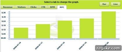
The best aspect of this new graph is its immediate comprehensibility. It aligns perfectly with Parked.com’s overall user-friendly philosophy, offering a clear and concise overview of crucial domain performance statistics. This is not just a cosmetic change; it’s a fundamental improvement in how domain owners can interact with and understand their data.
Key Features of the Enhanced Dashboard Graph: Actionable Insights at a Glance
The redesigned dashboard introduces several powerful features that significantly enhance the user experience and analytical capability:
- Intuitive Tabbed Navigation for Key Metrics: At the forefront of the new design are distinct tabs strategically placed along the top of the graph interface. These tabs allow users to effortlessly switch between various critical performance indicators:
- Revenue: Provides a clear daily breakdown of total earnings, essential for tracking financial performance.
- Visitors: Shows the number of unique visits your parked domains received, indicating traffic volume.
- Clicks: Displays the raw count of clicks, offering a direct measure of user engagement.
- CTR (Click-Through Rate): An invaluable metric showing the percentage of visitors who clicked on an ad, reflecting the effectiveness of your domain’s content and ad placement.
- RPM (Revenue Per Mille/Thousand): Illustrates the revenue generated for every thousand impressions, a key indicator of overall monetization efficiency.
- Revenue Per Click (RPC): Crucial for understanding the average value of each click, helping to identify high-value traffic and optimize bidding strategies.
This tabbed approach eliminates the visual clutter of the previous stacked graph, allowing users to focus on one metric at a time, facilitating deeper analysis without distraction.
- Real-time, Seamless Data Switching: A major usability triumph is that switching between these different metric tabs does not require a page refresh. This fluid interaction ensures that domain owners can rapidly compare various aspects of their domain’s performance, identify correlations, and quickly pinpoint areas needing attention, all without interruption. This responsiveness dramatically improves the workflow and efficiency for managing a portfolio of domains.
- Daily Performance at a Glance (Last Five Days): The graph specifically highlights the last five days’ statistics for each chosen metric. This focused, short-term view is incredibly practical for domain owners who need to monitor recent trends, react to sudden changes in traffic or revenue, and make timely adjustments to their monetization strategies. While a longer historical view might also be beneficial, providing immediate, recent data in a digestible format is a significant step forward for day-to-day management.
- Flexible Data Visualization: Line Graph Option: Catering to diverse analytical preferences, the new dashboard includes a convenient “line button.” A simple click transforms the data representation into a line graph. Line graphs are particularly effective for visualizing trends over time, making it easier to spot patterns, identify peaks and troughs, and understand the trajectory of a chosen metric. This versatility empowers users to select the visualization style that best suits their analytical needs, offering a different yet equally valuable perspective on their domain’s performance.
Why Superior Data Visualization Matters in Domain Parking
In the highly competitive domain parking industry, every decision, from choosing optimal ad layouts to assessing the value of traffic sources, is driven by data. A clear, intuitive dashboard is not merely a convenience; it’s a strategic asset. Parked.com’s improved graph directly contributes to empowering domain owners in several ways:
- Enhanced Decision Making: By providing clear, isolated views of critical metrics, users can quickly identify which domains are performing well, which need optimization, and where potential revenue gains can be made. This clarity enables more informed and data-driven decisions.
- Efficient Performance Monitoring: The ability to swiftly navigate through different performance indicators without refreshes makes daily monitoring far more efficient. Owners can spend less time struggling with the interface and more time analyzing their business.
- Identifying Trends and Anomalies: With the line graph option and clear daily data, spotting upward trends, sudden drops, or unusual spikes becomes straightforward. Early detection of these patterns can lead to proactive measures, whether it’s scaling up a successful strategy or mitigating a potential issue.
- Optimizing Monetization Strategies: Understanding the nuances of CTR, RPM, and RPC for specific domains allows owners to fine-tune their monetization approaches. For instance, a high CTR with low RPC might indicate a need to adjust ad types or advertisers, while a low CTR with high RPC suggests valuable but scarce traffic.
- Improved User Experience (UX): Ultimately, a well-designed dashboard fosters a positive user experience. When tools are easy to use and provide clear value, users are more engaged, satisfied, and loyal to the platform.
The Broader Impact: A Model for User-Centric Development
Parked.com’s swift and effective response to user feedback serves as an excellent case study in user-centric product development. It underscores the immense value of actively soliciting and genuinely integrating user suggestions into the development roadmap. In an industry where technological advancements are constant, companies that prioritize the practical needs and experiences of their users will inevitably stand out.
This transformation is more than just a new graph; it represents a commitment to empowering domain owners with the tools they need to succeed. It exemplifies how thoughtful design, combined with an agile development process, can turn complex data into actionable intelligence, ultimately fostering greater success for both the platform and its users.
The message is clear: when companies listen, innovate, and simplify, everyone benefits. Parked.com has set a new standard for dashboard usability in domain parking, proving that a simple yet valuable graph can indeed revolutionize how domain owners manage their digital assets.