Dashboard Graph, Improves Usability — Parked Changes
Domain parking firm creates simple yet valuable graph on dashboard.
It’s always nice when firms listen to suggestions.
Earlier this month I made a few usability suggestions to domain name firms. One of these was to change the graph on Parked.com’s dashboard. The graph didn’t make a lot of sense. It doesn’t make sense to have a stacked column graph for RPM, CTR, and RPC. RPC is so modest compared to the rest that you can’t see it, and the sum of these three measures doesn’t mean much.
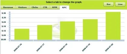
Now, just a couple weeks later, Parked has replaced the graph with a fresh and valuable graph. The best part is it is simple and easy to understand, just like most of Parked’s site.
The tabs along the top let you see your last five days’ stats for revenue, visitors, clicks, CTR, RPM, and revenue per click. Switching between tabs doesn’t require a refresh. If line graphs are more your style, just click the line button for a different perspective.