
Elevating User Experience: Practical UI/UX Design Tips for Domain Companies
The domain industry, while crucial to the internet’s infrastructure, isn’t always known for its stellar user interfaces. Navigating domain marketplaces and management platforms can sometimes feel clunky and unintuitive. Given the importance of these platforms for domain investors, website owners, and businesses alike, focusing on user experience (UX) and user interface (UI) design is paramount. This article offers practical suggestions for domain companies looking to enhance their platforms and create a more seamless and enjoyable experience for their users.
While professional UI/UX designers can bring immense value with their expertise, implementing even simple improvements can make a significant difference. Let’s explore specific examples from popular domain companies and identify areas where UX and UI enhancements could lead to increased user satisfaction and ultimately, greater business success.
Sedo: Optimizing Auction Listings for Clarity
Sedo is a leading platform for domain name auctions, facilitating countless transactions within the domain industry. However, one persistent frustration for users lies in the presentation of auction listings. Domain names exceeding 13 characters are often truncated, obscuring the full name and requiring users to hover over the listing to reveal the complete domain. This adds an unnecessary layer of interaction and can be particularly cumbersome when browsing through numerous auctions.
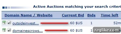
Consider the example of “OutsideInvestors.com.” On the auction listing, the domain name is cut short despite ample space available. This seemingly minor issue can impede a user’s ability to quickly scan and identify relevant domain names, potentially leading to missed opportunities. A simple adjustment to the display logic, allowing longer domain names to be fully visible within the allocated space, would significantly improve the browsing experience.
Sedo could also consider implementing responsive design principles to dynamically adjust the layout based on screen size, ensuring optimal readability across various devices. This attention to detail would not only enhance the user experience but also demonstrate Sedo’s commitment to providing a user-friendly platform.
GoDaddy: Bridging the Gap Between Marketing and User Experience
GoDaddy, a household name in the domain and web hosting industry, often employs attention-grabbing marketing campaigns to attract new customers. However, sometimes these marketing efforts can create a disconnect between user expectations and the actual platform experience.

For example, a prominent image of a celebrity like Danica Patrick on the GoDaddy homepage might lead users to believe that they can somehow acquire or incorporate the celebrity’s name into their domain. While this is clearly not the case, the prominent placement could lead to initial confusion or a feeling of being misled. Furthermore, during the domain purchase process, users are presented with a plethora of upsell options, ranging from private registration to web hosting plans. The absence of any offering related to the celebrity featured on the homepage creates a missed opportunity to connect the marketing message with a relevant product or service, even if it is just a humorous tie-in.
GoDaddy could explore ways to integrate their marketing campaigns more seamlessly with the user experience. This could involve creating targeted landing pages that directly address the themes highlighted in their advertisements, or incorporating subtle references to their marketing campaigns within the domain purchase flow. By aligning marketing messages with the actual platform experience, GoDaddy can enhance user engagement and create a more cohesive brand image.
Parked.com: Refining Data Visualization for Enhanced Insights
Parked.com stands out in the domain parking industry for its user-friendly interface, particularly its AJAX dashboard for managing parked domains. However, the overview graph displayed on the homepage presents an opportunity for improvement. The current stacked column graph, which attempts to visualize RPM (Revenue Per Mille), CTR (Click-Through Rate), and RPC (Revenue Per Click), is not only difficult to interpret but also potentially misleading.
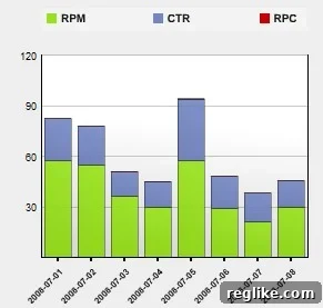
The stacked column format makes it challenging to compare the individual metrics, especially RPC, which is often dwarfed by the other two measures. Furthermore, the sum of RPM, CTR, and RPC doesn’t provide any meaningful insights. A more effective approach would be to use a dual-axis line graph, allowing users to easily track the trends of each metric over time. This would provide a clearer picture of the performance of their parked domains and enable them to make more informed decisions.
By adopting more effective data visualization techniques, Parked.com can empower its users with actionable insights and further solidify its reputation as a leader in the domain parking industry. The key is to choose a visual representation that accurately reflects the underlying data and makes it easy for users to understand the trends and patterns.
The Importance of Continuous UI/UX Improvement
These examples from Sedo, GoDaddy, and Parked.com highlight the importance of continuous UI/UX improvement in the domain industry. By focusing on user feedback, conducting usability testing, and staying abreast of the latest design trends, domain companies can create platforms that are not only functional but also enjoyable to use. A positive user experience can lead to increased user engagement, higher conversion rates, and ultimately, greater business success.
Investing in UI/UX design is not merely about aesthetics; it’s about creating a seamless and intuitive experience for users. By simplifying navigation, optimizing information architecture, and providing clear and concise communication, domain companies can empower their users to achieve their goals more efficiently and effectively. This, in turn, fosters loyalty and positions them as leaders in the competitive domain industry.
Furthermore, accessibility should be a key consideration in UI/UX design. Ensuring that platforms are accessible to users with disabilities is not only ethically responsible but also expands the potential user base. Adhering to accessibility guidelines, such as WCAG (Web Content Accessibility Guidelines), can significantly improve the usability of a platform for all users.
In conclusion, the domain industry has a significant opportunity to elevate the user experience by focusing on practical UI/UX design improvements. By addressing specific pain points, adopting best practices, and prioritizing user feedback, domain companies can create platforms that are not only functional but also enjoyable and empowering to use. This investment in user experience will ultimately pay dividends in terms of increased user engagement, higher conversion rates, and a stronger competitive advantage.
Your Turn: Share Your UI/UX Frustrations
What UI/UX frustrations have you encountered while using domain-related platforms? Share your experiences and suggestions in the comments below. Your feedback can help drive positive change and contribute to a better user experience for everyone in the domain industry.