State of ICANN’s Web Site — The Confusing
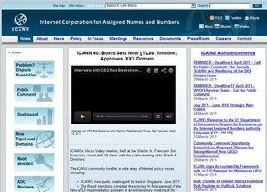
ICANN’s web site gets a minor face lift, but there’s a long way to go.
It’s not a big change, and it’s welcome, but why can’t there be a reasonably usable ICANN web site?
ICANN has refreshed the color scheme on its ICANN.org web site so it no longer looks like it was created in 1994.
The fresh design as a more pleasing white color scheme rather than the dark blue one we had become accustomed to.
Here’s the old design:
And here’s the fresh one:
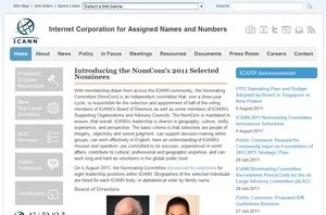
The social networking icons look a bit trendier, too.
Unfortunately what hasn’t changed is the byzantine content structure. Former ICANN staffer Kieren McCarthy was working on an overhaul of the site to make it easier to find information, but it looks like that costly effort was abandoned when he left.
The drop down navigation still has 136 selections (yes, I counted them). Does “Vint Cerf’s Legacy Letter to ICANN Community” really need to be linked to from the home page?